Variography#
The variogram#
General#
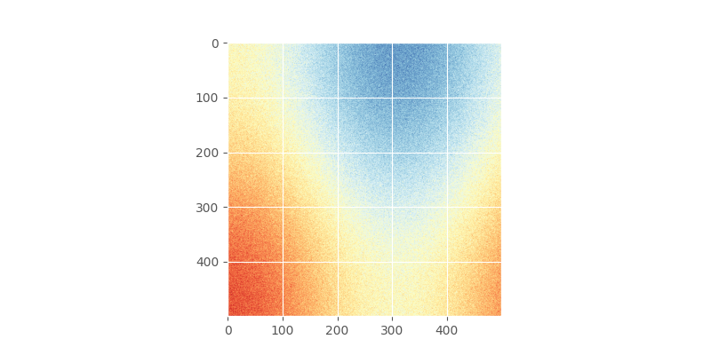
We start by constructing a random field and sample it. Without knowing about random field generators, an easy way to go is to stick two trigonometric functions together and add some noise. There should be clear spatial correlation apparent.
In [1]: import numpy as np

In [2]: import matplotlib.pyplot as plt

In [3]: plt.style.use('ggplot')

In [4]: from pprint import pprint
This field could look like
# apply the function to a meshgrid and add noise
In [5]: xx, yy = np.mgrid[0:0.5 * np.pi:500j, 0:0.8 * np.pi:500j]

In [6]: np.random.seed(42)

# generate a regular field
In [7]: _field = np.sin(xx)**2 + np.cos(yy)**2 + 10

# add noise
In [8]: np.random.seed(42)

In [9]: z = _field + np.random.normal(0, 0.15, (500,  500))

In [10]: plt.imshow(z, cmap='RdYlBu_r')
Out[10]: <matplotlib.image.AxesImage at 0x7f24e07cbcb0>

In [11]: plt.close()
Using scikit-gstat#
It’s now easy and straightforward to calculate a variogram using
scikit-gstat. We need to sample the field and pass the coordinates and
value to the Variogram Class.
In [12]: import skgstat as skg
# random coordinates
In [13]: np.random.seed(42)
In [14]: coords = np.random.randint(0, 500, (300, 2))
In [15]: values = np.fromiter((z[c[0], c[1]] for c in coords), dtype=float)
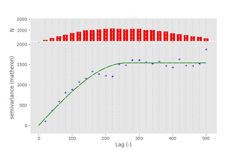
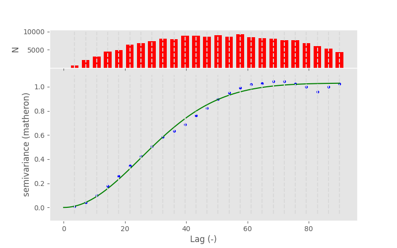
In [16]: V = skg.Variogram(coords, values)
In [17]: V.plot()
Out[17]: <Figure size 800x500 with 2 Axes>
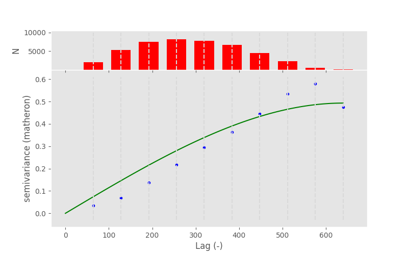
From my personal point of view, there are three main issues with this approach:
If one is not an geostatistics expert, one has no idea what he actually did and can see in the presented figure.
The figure includes an spatial model, one has no idea if this model is suitable and fits the observations (wherever they are in the figure) sufficiently.
Refer to the
__init__method of the Variogram class. There are 10+ arguments that can be set optionally. The default values will most likely not fit your data and requirements.
Therefore one will have to understand how the
Variogram Class works along with some basic
knowledge about variography in order to be able to properly use scikit-gstat.
However, what we can discuss from the figure, is what a variogram actually is. At its core it relates a dependent variable to an independent variable and, in a second step, tries to describe this relationship with a statistical model. This model on its own describes some of the spatial properties of the random field and can further be utilized in an interpolation to select nearby points and weight them based on their statistical properties.
The variogram relates the separating distance between two observation points to a measure of observation similarity at that given distance. Our expectation is that variance is increasing with distance, what can basically be seen in the presented figure.
Distance#
Consider the variogram figure from above, with which an independent and dependent variable was introduced. In statistics it is common to use dependent variable as an alias for target variable, because its value is dependent on the state of the independent variable. In the case of a variogram, this is the metric of variance on the y-axis. In geostatistics, the independent variable is usually a measure of Euclidean distance.
Consider observations taken in the environment, it is fairly unlikely to find
two pairs of observations where the separating distance between the
coordinates match exactly the same value. Therefore one has to group all
point pairs at the same distance lag together into one group, or bin.
Beside practicability, there is also another reason, why one would want to
group point pairs at similar separating distances together into one bin.
Consider the plot below, which shows the difference in value over the
distance for all point pair combinations that can be formed for a given sample.
The Variogram Class has a function for that:
distance_difference_plot:
In [18]: V.distance_difference_plot()
Out[18]: <Figure size 800x600 with 1 Axes>

In [19]: plt.close()
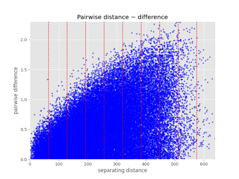
While it is possible to see the increasing variability with increasing distance here quite nicely, it is not possible to guess meaningful moments for the distributions at different distances. Last but not least, to derive a simple model as presented in the variogram figure above by the green line, we have to be able to compress all values at a given distance lag to one estimation of variance. This would not be possible from the the figure above.
Note
There are also procedures that can fit a model directly based on unbinned
data. As none of these methods is implemented into scikit-gstat, they
will not be discussed here. If you need them, you are more than welcome
to implement them.
Binning the separating distances into distance lags is therefore a crucial and most important task in variogram analysis. The final binning must discretizise the distance lag at a meaningful resolution at the scale of interest while still holding enough members in the bin to make valid estimations. Often this is a trade-off relationship and one has to find a suitable compromise.
Before diving into binning, we have to understand how the
Variogram Class handles distance data. The
distance calculation can be controlled by the
dist_func argument, which
takes either a string or a function. The default value is 'euclidean'.
This value is directly passed down to the
pdist as the metric argument.
Consequently, the distance data is stored as a distance matrix for all
input locations passed to Variogram on
creation. To be more precise, only the upper triangle is stored
in a array with the distance values sorted
row-wise. Consider this very straightforward set of locations:
In [20]: locations = [[0,0], [0,1], [1,1], [1,0]]

In [21]: V = skg.Variogram(locations, [0, 1, 2, 1], normalize=False)

In [22]: V.distance
Out[22]: array([1.   , 1.414, 1.   , 1.   , 1.414, 1.   ])

# turn into a 2D matrix again
In [23]: from scipy.spatial.distance import squareform

In [24]: print(squareform(V.distance))
[[0.    1.    1.414 1.   ]
 [1.    0.    1.    1.414]
 [1.414 1.    0.    1.   ]
 [1.    1.414 1.    0.   ]]
Binning#
As already mentioned, in real world observation data, there won’t
be two observation location pairs at exactly the same distance.
Thus, we need to group information about point pairs at similar distance
together, to learn how similar their observed values are.
With a Variogram, we will basically try
to find and describe some systematic statistical behavior from these
similarities. The process of grouping distance data together is
called binning.
scikit-gstat has many different methods for binning distance data.
They can be set using the bin_func
attribute. You have to pass the name of the method.
The available methods are:
even- evenly spaced binsuniform- same sample sized binssturges- derive number of bins by Sturge’s rulescott- derive number of bins by Scotts’s rulesqrt- derive number of bins by sqaureroot ruledoane- derive number of bins by Doane’s rulefd- derive number of bins by Freedmann-Diaconis estimatorkmeans- derive bins by K-Means clusteringward- derive bins by hierarchical clustering and Ward’s criterionstable_entropy- derive bins from stable entropy setting
['even', 'uniform', 'kmeans', 'ward', 'stable_entropy'] methods will use two parameters
to calculate the bins from the distance matrix: n_lags,
the amount of bins, and maxlag, the maximum distance lag to be considered.
['sturges', 'scott', 'sqrt', 'fd', 'doane'] will only use maxlag
to derive n_lags from statistical properties of the distance matrix.
The even method will
then form n_lags bins from 0 to maxlag
of same width.
The uniform method will form the same amount of classes
within the same range, using the same point pair count in each bin.
The following example illustrates this:
In [25]: from skgstat.binning import even_width_lags, uniform_count_lags

In [26]: from scipy.spatial.distance import pdist

In [27]: loc = np.random.normal(50, 10, size=(30, 2))

In [28]: distances = pdist(loc)
Now, look at the different bin edges for the calculated dummy distance matrix:
In [29]: even_width_lags(distances, 10, 250)
Out[29]:
(array([ 4.405,  8.809, 13.214, 17.618, 22.023, 26.427, 30.832, 35.237,
        39.641, 44.046]),
 None)

In [30]: uniform_count_lags(distances, 10, 250)
Out[30]:
(array([ 7.198, 10.432, 12.34 , 15.147, 17.693, 20.381, 23.013, 26.278,
        30.641, 44.046]),
 None)
Using the Variogram you can see how the setting
of different binning methods will update the Variogram.bins
and eventually n_lags:
In [31]: test = skg.Variogram(
   ....:     *skg.data.pancake().get('sample'),  # use some sample data
   ....:     n_lags=25,                          # set 25 classes
   ....:     bin_func='even'
   ....: )
   ....:

In [32]: print(test.bins)
[ 26.955  53.91   80.865 107.82  134.775 161.73  188.684 215.639 242.594
 269.549 296.504 323.459 350.414 377.369 404.324 431.279 458.234 485.189
 512.144 539.099 566.053 593.008 619.963 646.918 673.873]
Now, we can easily switch to a method that will derive a new value for n_lags.
That will auto-update Variogram.bins
and n_lags.
# sqrt will very likely estimate way more bins
In [33]: test.bin_func = 'sqrt'

In [34]: print(f'Auto-derived {test.n_lags} bins.')
Auto-derived 354 bins.

In [35]: print(V.bins)
[0.141 0.283 0.424 0.566 0.707 0.849 0.99  1.131 1.273 1.414]
Observation differences#
By the term observation differences, the distance between the observed values are meant. As already laid out, the main idea of a variogram is to systematially relate similarity of observations to their spatial proximity. The spatial part was covered in the sections above, finalized with the calculation of a suitable binning of all distances. We want to relate exactly these bins to a measure of similarity of all observation point pairs that fall into this bin.
That’s basically it. We need to do three more steps to come up with one value per bin, statistically describing the similarity at that distance.
Find all point pairs that fall into a bin
Calculate the distance (difference) of the observed values
Describe all differences by one number
Finding all pairs within a bin is straightforward. We already have
the bin edges and all distances between all possible observation
point combinations (stored in the distance matrix). Using the
squareform function
of scipy, we could turn the distance matrix into a 2D version.
Then the row and column indices align with the values indices.
However, Variogram implements
a method for doing mapping a bit more efficiently.
A array of bin groups for each point pair that
is indexed exactly like the distance
array can be obtained by lag_groups.
This will be illustrated by some sample data from the data
submodule.
In [36]: coords, vals = skg.data.pancake(N=200).get('sample')

In [37]: V = skg.Variogram(
   ....:         coords,
   ....:         vals,
   ....:         n_lags=25
   ....:     )
   ....:

In [38]: V.maxlag = 500
Then, you can compare the first 10 point pairs from the distance matrix
to the first 10 elements returned by the
lag_groups function.
# first 10 distances
In [39]: V.distance[:10].round(1)
Out[39]:
array([179.9,  51. , 151.2, 156.1,  12.8, 162.3, 142.4, 411.8, 156.5,
       257. ])

# first 10 groups
In [40]: V.lag_groups()[:10]
Out[40]: array([ 8,  2,  7,  7,  0,  8,  7, 20,  7, 12])
Now, we need the actual Variogram.bins
to verify the grouping.
In [41]: V.bins
Out[41]:
array([ 20.,  40.,  60.,  80., 100., 120., 140., 160., 180., 200., 220.,
       240., 260., 280., 300., 320., 340., 360., 380., 400., 420., 440.,
       460., 480., 500.])
The elements [2, 3, 6, 8]``are grouped into group ``7.
Their distance values are [151.2, 156.1, 142.4, 156.5].
The grouping starts with 0, therefore the corresponding upper bound of the bin
is at index 7 and the lower at 6.
The bin edges are therefore 140. < x < 160..
Consequently, the binning and grouping worked fine.
If you want to access all value pairs at a given group, it would of
course be possible to use the mechanism above to find the correct points.
However, Variogram offers an iterator
that already does that for you:
lag_classes. This iterator
will yield all pair-wise observation value differences for the bin
of the actual iteration. The first iteration (index = 0, if you wish)
will yield all differences of group id 0.
Note
lag_classes will yield
the difference in value of observation point pairs, not the pairs
themselves.
In [42]: for i, group in enumerate(V.lag_classes()):
   ....:     print('[Group %d]: %.2f' % (i, np.mean(group)))
   ....:
[Group 0]: 10.36
[Group 1]: 19.10
[Group 2]: 24.20
[Group 3]: 29.70
[Group 4]: 31.24
[Group 5]: 35.21
[Group 6]: 36.84
[Group 7]: 40.44
[Group 8]: 39.32
[Group 9]: 38.65
[Group 10]: 38.36
[Group 11]: 43.47
[Group 12]: 42.45
[Group 13]: 44.85
[Group 14]: 45.26
[Group 15]: 43.83
[Group 16]: 43.36
[Group 17]: 43.98
[Group 18]: 43.80
[Group 19]: 43.74
[Group 20]: 46.80
[Group 21]: 44.70
[Group 22]: 44.65
[Group 23]: 44.49
[Group 24]: 50.13
The only thing that is missing for a variogram is that we will not use the arithmetic mean to describe the realtionship.
Experimental variograms#
The last stage before a variogram function can be modeled is to define an experimental variogram, also known as empirical variogram, which will be used to parameterize a variogram model. However, the experimental variogram already contains a lot of information about spatial relationships in the data. Therefore, it’s worth looking at more closely. Last but not least a poor experimental variogram will also affect the variogram model, which is ultimatively used to interpolate the input data.
Note
In geostatistical literature you can find the terms experimental and
empirical variogram. Both refer to the varigoram estimated from a sample.
In SciKit-GStat the term experimental
variogram is used for the estimated semi-variances solely. Thus, this is a
1D structure (of length n_lags).
The term empirical (Variogram.get_empirical)
is used for the combination of bins and
experimental, thus it is a tuple of
two 1D arrays.
The previous sections summarized how distance is calculated and handled
by the Variogram class.
The lag_groups function makes it
possible to find corresponding observation value pairs for all distance
lags. Finally the last step will be to use a more suitable estimator
for the similarity of observation values at a specific lag.
In geostatistics this estimator is called semi-variance and the
the most popular estimator is called Matheron estimator.
By default, the Matheron estimator will be used.
It is defined as
\gamma (h) = \frac{1}{2N(h)} * \sum_{i=1}^{N(h)}(x)^2
with:
x = Z(x_i) - Z(x_{i+h})
where Z(x_i) is the observation value at the i-th location x_i. h is the distance lag and N(h) is the number of point pairs at that lag.
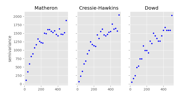
You will find more estimators in skgstat.estimators.
There is the Cressie-Hawkins,
which is more robust to extreme values. Other so called robust
estimators are Dowd or
Genton.
The remaining are experimental estimators and should only be used
with caution.
Let’s compare them directly. You could use the code from the last section
to group the pair-wise value differencens into lag groups and apply the
formula for each estimator. In the example below, we will iteratively change
the Variogram instance used so far to
achieve this:
In [43]: fig, _a = plt.subplots(1, 3, figsize=(8,4), sharey=True)

In [44]: axes = _a.flatten()

In [45]: axes[0].plot(V.bins, V.experimental, '.b')
Out[45]: [<matplotlib.lines.Line2D at 0x7f24dd46f650>]

In [46]: V.estimator = 'cressie'

In [47]: axes[1].plot(V.bins, V.experimental, '.b')
Out[47]: [<matplotlib.lines.Line2D at 0x7f24dd716d80>]

In [48]: V.estimator = 'dowd'

In [49]: axes[2].plot(V.bins, V.experimental, '.b')
Out[49]: [<matplotlib.lines.Line2D at 0x7f24dd46f770>]

In [50]: axes[0].set_ylabel('semivariance')
Out[50]: Text(0, 0.5, 'semivariance')

In [51]: axes[0].set_title('Matheron')
Out[51]: Text(0.5, 1.0, 'Matheron')

In [52]: axes[1].set_title('Cressie-Hawkins')
Out[52]: Text(0.5, 1.0, 'Cressie-Hawkins')

In [53]: axes[2].set_title('Dowd')
Out[53]: Text(0.5, 1.0, 'Dowd')

In [54]: fig.show()
Note
With this example it is not a good idea to use the Gention estimator, as it takes a long time to calculate the experimental variogram.
Variogram models#
The last step to describe the spatial pattern in a data set using variograms is to model the empirically observed and calculated experimental variogram with a proper mathematical function. Technically, this setp is straightforward. We need to define a function that takes a distance value and returns a semi-variance value. One big advantage of these models is, that we can assure different things, like positive definitenes. Most models are also monotonically increasing and approach an upper bound. Usually these models need three parameters to fit to the experimental variogram. All three parameters have a meaning and are useful to learn something about the data. This upper bound a model approaches is called sill. The distance at which 95% of the sill are approached is called the effective range. That means, the range is the distance at which observation values do not become more dissimilar with increasing distance. They are statistically independent. That also means, it doesn’t make any sense to further describe spatial relationships of observations further apart with means of geostatistics. The last parameter is the nugget. It is used to add semi-variance to all values. Graphically that means to move the variogram up on the y-axis. The nugget is the semi-variance modeled on the 0-distance lag. Compared to the sill it is the share of variance that cannot be described spatially.
Warning
There is a very important design decision underlying all models in SciKit-GStat.
All models take the effective range as a parameter. If you look into literature,
there is also the model parameter range. That can be very confusing, hence
it was decided to fit models on the effective range.
You can translate one into the other quite easily. Transformation factors are
reported in literature, but not commonly the same ones are used.
Finally, the transformation is always coded into SciKit-GStat’s
models, even if it’s a 1:1 transformation.
The spherical model#
The sperical model is the most commonly used variogram model. It is characterized by a very steep, exponential increase in semi-variance. That means it approaches the sill quite quickly. It can be used when observations show strong dependency on short distances. It is defined like:
\gamma = b + C_0 * \left({1.5*\frac{h}{r} - 0.5*\frac{h}{r}^3}\right)
if h < r, and
\gamma = b + C_0
else. b is the nugget, C_0 is the sill, h is the input
distance lag and r is the effective range. That is the range parameter
described above, that describes the correlation length.
Many other variogram model implementations might define the range parameter,
which is a variogram parameter. This is a bit confusing, as the range parameter
is specific to the used model. Therefore I decided to directly use the
effective range as a parameter, as that makes more sense in my opinion.
As we already calculated an experimental variogram and find the spherical
model in the models sub-module, we can utilize e.g.
curve_fit from scipy to fit the model
using a least squares approach.
Note
With the given example, the default usage of curve_fit
will use the Levenberg-Marquardt algorithm, without initial guess for the parameters.
This will fail to find a suitable range parameter.
Thus, for this example, you need to pass an initial guess to the method.
In [55]: from skgstat import models

# set estimator back
In [56]: V.estimator = 'matheron'

In [57]: V.model = 'spherical'

In [58]: xdata = V.bins

In [59]: ydata = V.experimental

In [60]: from scipy.optimize import curve_fit

# initial guess - otherwise lm will not find a range
In [61]: p0 = [np.mean(xdata), np.mean(ydata), 0]

In [62]: cof, cov =curve_fit(models.spherical, xdata, ydata, p0=p0)
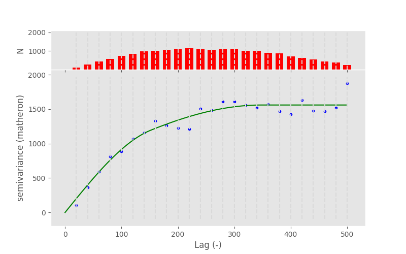
Here, cof are now the coefficients found to fit the model to the data.
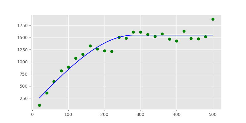
In [63]: print("range: %.2f   sill: %.f   nugget: %.2f" % (cof[0], cof[1], cof[2]))
range: 281.73   sill: 1446   nugget: 101.66
In [64]: xi =np.linspace(xdata[0], xdata[-1], 100)

In [65]: yi = [models.spherical(h, *cof) for h in xi]

In [66]: plt.plot(xdata, ydata, 'og')
Out[66]: [<matplotlib.lines.Line2D at 0x7f24dd46f620>]

In [67]: plt.plot(xi, yi, '-b');
The Variogram Class does in principle the
same thing. The only difference is that it tries to find a good
initial guess for the parameters and limits the search space for
parameters. That should make the fitting more robust.
Technically, we used the Levenberg-Marquardt algorithm above.
That’s a commonly used, very fast least squares implementation.
However, sometimes it fails to find good parameters, as it is
unbounded and searching an invalid parameter space.
The default for Variogram is
Trust-Region Reflective (TRF), which is also the default for
Variogram. It uses a valid parameter space as bounds
and therefore won’t fail in finding parameters.
You can, however, switch to Levenberg-Marquardt
by setting the Variogram.fit_method
to ‘lm’.
In [68]: V.fit_method ='trf'

In [69]: V.plot();

In [70]: pprint(V.parameters)
[np.float64(263.12497861564043), np.float64(1539.0278111437954), 0]

In [71]: V.fit_method ='lm'

In [72]: V.plot();

In [73]: pprint(V.parameters)
[np.float64(263.1204560914702), np.float64(1539.0230394023079), 0]

Note
In this example, the fitting method does not make a difference at all. Generally, you can say that Levenberg-Marquardt is faster and TRF is more robust.
Exponential model#
The exponential model is quite similar to the spherical one. It models semi-variance values to increase exponentially with distance, like the spherical. The main difference is that this increase is not as steep as for the spherical. That means, the effective range is larger for an exponential model, that was parameterized with the same range parameter.
Note
Remember that SciKit-GStat uses the effective range to overcome this confusing behaviour.
Consequently, the exponential can be used for data that shows a way too large spatial correlation extent for a spherical model to capture.
Applied to the data used so far, you can see the difference between the two models quite nicely:
In [74]: fig, axes = plt.subplots(1, 2, figsize=(8, 4), sharey=True)

In [75]: axes[0].set_title('Spherical')
Out[75]: Text(0.5, 1.0, 'Spherical')

In [76]: axes[1].set_title('Exponential')
Out[76]: Text(0.5, 1.0, 'Exponential')

In [77]: V.fit_method = 'trf'

In [78]: V.plot(axes=axes[0], hist=False)
Out[78]: <Figure size 800x400 with 2 Axes>

# switch the model
In [79]: V.model = 'exponential'

In [80]: V.plot(axes=axes[1], hist=False);
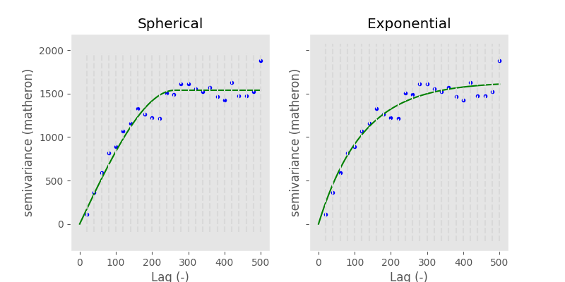
Keep in mind how important the theoretical model is. We will use it for interpolation later on and the quality of this interpolation will primarily rely on the fit of the model to the experimental data smaller than the effective range. From the example above it is quite hard to tell, which is the correct one. Also, the goodness of fit is quite comparable:
# spherical
In [81]: V.model = 'spherical'

In [82]: rmse_sph = V.rmse

In [83]: r_sph = V.describe().get('effective_range')

# exponential
In [84]: V.model = 'exponential'

In [85]: rmse_exp = V.rmse

In [86]: r_exp = V.describe().get('effective_range')

In [87]: print('Spherical   RMSE: %.2f' % rmse_sph)
Spherical   RMSE: 114.70

In [88]: print('Exponential RMSE: %.2f' % rmse_exp)
Exponential RMSE: 104.83
But the difference in effective range is more pronounced:
In [89]: print('Spherical effective range:    %.1f' % r_sph)
Spherical effective range:    263.1

In [90]: print('Exponential effective range:  %.1f' % r_exp)
Exponential effective range:  363.3
Finally, we can use both models to perform a Kriging interpolation.
In [91]: fig, axes = plt.subplots(1, 2, figsize=(8, 4))

In [92]: V.model = 'spherical'

In [93]: krige1 = V.to_gs_krige()

In [94]: V.model = 'exponential'

In [95]: krige2 = V.to_gs_krige()

# build a grid
In [96]: x = y = np.arange(0, 500, 5)

# apply
In [97]: field1, _ = krige1.structured((x, y))

In [98]: field2, _ = krige2.structured((x, y))

# use the same bounds
In [99]: vmin = np.min((field1, field2))

In [100]: vmax = np.max((field1, field2))

# plot
In [101]: axes[0].set_title('Spherical')
Out[101]: Text(0.5, 1.0, 'Spherical')

In [102]: axes[1].set_title('Exponential')
Out[102]: Text(0.5, 1.0, 'Exponential')

In [103]: axes[0].imshow(field1, origin='lower', cmap='terrain_r', vmin=vmin, vmax=vmax)
Out[103]: <matplotlib.image.AxesImage at 0x7f24e0774a10>

In [104]: axes[1].imshow(field2, origin='lower', cmap='terrain_r', vmin=vmin, vmax=vmax)
Out[104]: <matplotlib.image.AxesImage at 0x7f24e6ac7470>
While the two final maps look alike, in the difference plot, you can spot some differences. While performing an analysis, with the model functions in mind, you should take these differences and add them as uncertainty cause by model choice to your final result.
# calculate the differences
In [105]: diff = np.abs(field2 - field1)

In [106]: print('Mean difference:     %.1f' % np.mean(diff))
Mean difference:     1.0

In [107]: print('3rd quartile diffs.: %.1f' % np.percentile(diff, 75))
3rd quartile diffs.: 1.4

In [108]: print('Max differences:     %.1f' % np.max(diff))
Max differences:     9.9

In [109]: plt.imshow(diff, origin='lower', cmap='hot')
Out[109]: <matplotlib.image.AxesImage at 0x7f24e6e5e210>

In [110]: plt.colorbar()
Out[110]: <matplotlib.colorbar.Colorbar at 0x7f24e075abd0>
Gaussian model#
The last fundamental variogram model is the Gaussian. Unlike the spherical and exponential it models a very different spatial relationship between semi-variance and distance. Following the Gaussian model, observations are assumed to be similar up to intermediate distances, showing just a gentle increase in semi-variance. Then, the semi-variance increases dramatically within just a few distance units up to the sill, which is again approached asymtotically. The model can be used to simulate very sudden and sharp changes in the variable at a specific distance, while being very similar at smaller distances.
To show a typical Gaussian model, we will load another sample dataset, that actually shows a Gaussian experimental variogram.
In [111]: import pandas as pd

In [112]: data = pd.read_csv('data/sample_lr.csv')

In [113]: Vg = skg.Variogram(list(zip(data.x, data.y)), data.z.values,
   .....:     normalize=False, n_lags=25, maxlag=90, model='gaussian')
   .....:

In [114]: Vg.plot();
Matérn model#
Another, quite powerful model is the Matérn model. Especially in cases where you cannot chose the appropriate model a priori so easily. The Matérn model takes an additional smoothness parameter, that can change the shape of the function in between an exponential model shape and a Gaussian one.
In [115]: xi = np.linspace(0, 100, 100)

# plot a exponential and a gaussian
In [116]: y_exp = [models.exponential(h, 40, 10, 3) for h in xi]

In [117]: y_gau = [models.gaussian(h, 40, 10, 3) for h in xi]

In [118]: fig, ax = plt.subplots(1, 1, figsize=(8,6))

In [119]: ax.plot(xi, y_exp, '-b', label='exponential')
Out[119]: [<matplotlib.lines.Line2D at 0x7f24dd085be0>]

In [120]: ax.plot(xi, y_gau, '-g', label='gaussian')
Out[120]: [<matplotlib.lines.Line2D at 0x7f24dd085f10>]

In [121]: for s in (0.5, 1., 10.):
   .....:     y = [models.matern(h, 40, 10, s, 3) for h in xi]
   .....:     ax.plot(xi, y, '--k', label='matern s=%.1f' % s)
   .....:

In [122]: plt.legend(loc='lower right')
Out[122]: <matplotlib.legend.Legend at 0x7f24dd086450>
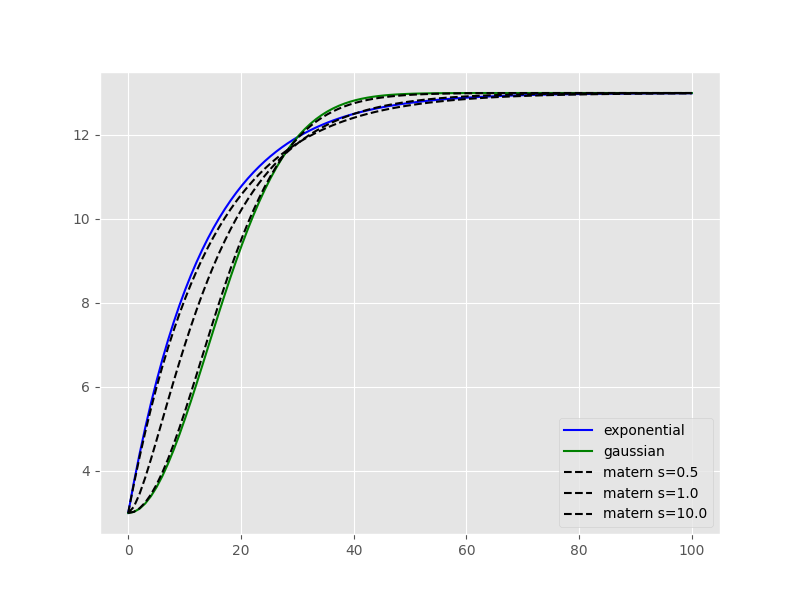
This example illustrates really nicely, how the smoothness parameter adapts the Matérn model shape. Moreover, the smoothness parameter can be used to assess whether an experimental variogram is rather showing a Gaussian or exponential behavior.
Note
If you would like to export a Variogram instance to gstools, the smoothness parameter
may not be smaller than 0.2.
Sum of models#
All the above models can be combined into a sum of models, in order to fit more complex empirical variograms that might capture signals with multiple correlations ranges. To fit with a sum of models, simply add a “+” between any number of models:
# Fit a sum of two spherical models
In [123]: V.model = "spherical+spherical"

In [124]: V.plot();
Custom model#
Additionally, any custom model can be passed to the model argument to fit a specific function to the empirical
variogram. This model needs to be built with the @variogram decorator, which requires the lag argument
(typically, h) to be listed first in the custom function.
Caution
When using a custom model, it is highly recommended to define the parameter bounds as these cannot be derived
logically by SciKit-GStat as for other models. This is done by passing either fit_bounds to Variogram()
at instantiation or bounds to Variogram.fit().
# Build a custom model by applying the @variogram decorator (here adding a linear term to a spherical model)
In [125]: from skgstat.models import variogram, spherical

In [126]: @variogram
   .....: def custom_model(h, r1, c1, a, b=0):
   .....:     return spherical(h, r1, c1, b) + h * a
   .....:

# We define the bounds for r1, c1, a and b
In [127]: bounds_custom = ([0, 0, 0, 0], [np.max(V.bins), np.max(V.experimental), 2, 0.1])

In [128]: V.fit(bounds=bounds_custom)

In [129]: V.plot();

When direction matters#
What is ‘direction’?#
The classic approach to calculate a variogram is based on the assumption that covariance between observations can be related to their separating distance. For this, point pairs of all observation points are formed and it is assumed that they can be formed without any restriction. The only parameter to be influenced is a limiting distance, beyond which a point pair does not make sense anymore.
This assumption might not always hold. Especially in landscapes, processes do not occur randomly, but in an organized manner. This organization is often directed, which can lead to stronger covariance in one direction than another. Therefore, another step has to be introduced before lag classes are formed.
The direction of a variogram is then a orientation, which two points need.
If they are not oriented in the specified way, they will be ignored while calculating
a semi-variance value for a given lag class. Usually, you will specify a
orientation, which is called azimuth,
and a tolerance, which is an
offset from the given azimuth, at which a point pair will still be accepted.
Defining orientation#
One has to decide how orientation of two points is determined. In scikit-gstat, orientation between two observation points is only defined in \mathbb{R}^2. We define the orientation as the angle between the vector connecting two observation points with the x-axis.
Thus, also the azimuth is defined as an
angle of the azimutal vector to the x-axis, with an
tolerance in degrees added to the
exact azimutal orientation clockwise and counter clockwise.
The angle \Phi between two vectors u,v is given like:
\Phi = cos^{-1}\left(\frac{u \circ v}{||u|| \cdot ||v||}\right)
In [130]: from matplotlib.patches import FancyArrowPatch as farrow

In [131]: fig, ax = plt.subplots(1, 1, figsize=(6,4))

In [132]: ax.arrow(0,0,2,1,color='k')
Out[132]: <matplotlib.patches.FancyArrow at 0x7f24dcd9ef60>

In [133]: ax.arrow(-.1,0,3.1,0,color='k')
Out[133]: <matplotlib.patches.FancyArrow at 0x7f24dcd446e0>

In [134]: ax.set_xlim(-.1, 3)
Out[134]: (-0.1, 3.0)

In [135]: ax.set_ylim(-.1,2.)
Out[135]: (-0.1, 2.0)

In [136]: ax.scatter([0,2], [0,1], 50, c='r')
Out[136]: <matplotlib.collections.PathCollection at 0x7f24dcdb5460>

In [137]: ax.annotate('A (0, 0)', (.0, .26), fontsize=14)
Out[137]: Text(0.0, 0.26, 'A (0, 0)')

In [138]: ax.annotate('B (2, 1)', (2.05,1.05), fontsize=14)
Out[138]: Text(2.05, 1.05, 'B (2, 1)')

In [139]: arrowstyle="Simple,head_width=6,head_length=12,tail_width=1"

In [140]: ar = farrow([1.5,0], [1.25, 0.625],  color='r', connectionstyle="arc3, rad=.2", arrowstyle=arrowstyle)

In [141]: ax.add_patch(ar)
Out[141]: <matplotlib.patches.FancyArrowPatch at 0x7f24dcd14ec0>

In [142]: ax.annotate('26.5°', (1.5, 0.25), fontsize=14, color='r')
Out[142]: Text(1.5, 0.25, '26.5°')
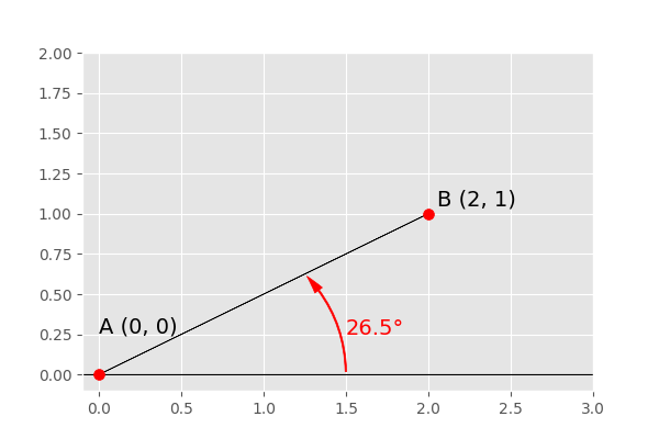
The described definition of orientation is illustrated in the figure above.
There are two observation points, A (0,0) and B (2, 1). To decide
whether to account for them when calculating the semi-variance at their separating
distance lag, their orientation is used. Only if the direction of the varigram includes
this orientation, the points are used. Imagine the azimuth and tolerance would be
45°, then anything between 0° (East) and 90° orientation would be included.
The given example shows the orientation angle \Phi = 26.5°, which means the
vector \overrightarrow{AB} is included.
Calculating orientations#
SciKit-GStat implements a slightly adapted version of the formula given in the last section. It makes use of symmetric search areas (tolerance is applied clockwise and counter clockwise) und therefore any calculated angle might be the result of calculating the orientation of \overrightarrow{AB} or \overrightarrow{BA}. Mathematically, these two vectors have two different angles, but they are always both taken into account or omitted for a variagram at the same time. Thus, it does not make a difference for variography. However, it does make a difference when you try to use the orientation angles directly as the containing matrix can contain the inverse angles.
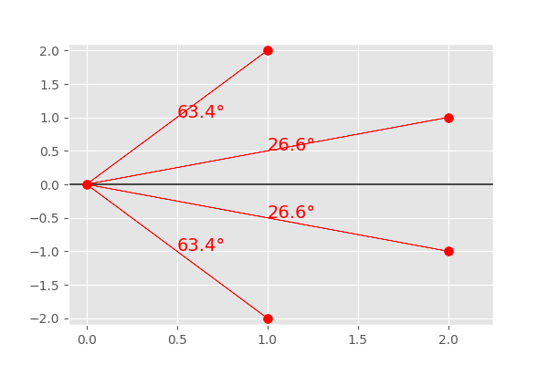
This can be demonstrated by an easy example. Let c be a set of points mirrored
along the x-axis.
In [143]: c = np.array([[0,0], [2,1], [1,2], [2, -1], [1, -2]])

In [144]: east = np.array([1,0])
We can plug these two arrays into the the formula above:
In [145]: u = c[1:]   # omit the first one

In [146]: angles = np.degrees(np.arccos(u.dot(east) / np.sqrt(np.sum(u**2, axis=1))))

In [147]: angles.round(1)
Out[147]: array([26.6, 63.4, 26.6, 63.4])
You can see, that the both points and their mirrored counterpart have the same angle to the x-axis, just like expected. This can be visualized by the plot below:
In [148]: fig, ax = plt.subplots(1, 1, figsize=(6,4))

In [149]: ax.set_xlim(-.1, 2.25)
Out[149]: (-0.1, 2.25)

In [150]: ax.set_ylim(-2.1,2.1)
Out[150]: (-2.1, 2.1)

In [151]: ax.arrow(-.1,0,3.1,0,color='k')
Out[151]: <matplotlib.patches.FancyArrow at 0x7f24dcdcb110>

In [152]: for i,p in enumerate(u):
   .....:     ax.arrow(0,0,p[0],p[1],color='r')
   .....:     ax.annotate('%.1f°' % angles[i], (p[0] / 2, p[1] / 2 ), fontsize=14, color='r')
   .....:

In [153]: ax.scatter(c[:,0], c[:,1], 50, c='r')
Out[153]: <matplotlib.collections.PathCollection at 0x7f24dcdca060>
The main difference to the internal structure storing the orientation angles for a
DirectionalVariogram instance will store different
angles.
To use the class on only five points, we need to prevent the class from fitting, as
fitting on only 5 points will not work. But this does not affect the orientation calculations.
Therefore, the fit method is overwritten.
In [154]: class TestCls(skg.DirectionalVariogram):
   .....:     def fit(*args, **kwargs):
   .....:         pass
   .....:

In [155]: DV = TestCls(c, np.random.normal(0,1,len(c)))

In [156]: DV._calc_direction_mask_data()

In [157]: np.degrees(DV._angles + np.pi)[:len(c) - 1]
Out[157]: array([ 26.565,  63.435, 333.435, 296.565])
The first two points (with positive y-coordinate) show the same result. The other two, with negative y-coordinates, are also calculated counter clockwise:
In [158]: 360 - np.degrees(DV._angles + np.pi)[[2,3]]
Out[158]: array([26.565, 63.435])
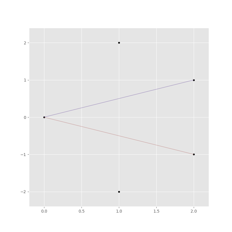
The DirectionalVariogram class has a plotting
function to show a network graph of all point pairs that are oriented in the
variogram direction. But first we need to increase the tolerance as half tolerance
(45° / 2 = 22.5° clockwise and counter clockwise) is smaller than both orientations.
In [159]: DV.tolerance = 90

In [160]: DV.pair_field()
Out[160]: <Figure size 800x800 with 1 Axes>
Directional variogram#
In [161]: field = np.loadtxt('data/aniso_x2.txt')

In [162]: np.random.seed(1312)

In [163]: coords = np.random.randint(100, size=(300,2))

In [164]: vals = [field[_[0], _[1]] for _ in coords]
The next step is to create two different variogram instances, which share the same parameters, but use a different azimuth angle. One oriented to North and the second one oriented to East.
In [165]: Vnorth = skg.DirectionalVariogram(coords, vals, azimuth=90, tolerance=90, maxlag=80, n_lags=20)

In [166]: Veast = skg.DirectionalVariogram(coords, vals, azimuth=0, tolerance=90, maxlag=80, n_lags=20)

In [167]: pd.DataFrame({'north':Vnorth.describe(), 'east': Veast.describe()})
Out[167]:
                                                                        north                                               east
model                                                               spherical                                          spherical
estimator                                                            matheron                                           matheron
dist_func                                                           euclidean                                          euclidean
normalized_effective_range                                             6400.0                                        2933.082069
normalized_sill                                                      2.844523                                           0.810282
normalized_nugget                                                           0                                                  0
effective_range                                                          80.0                                          36.663526
sill                                                                 1.483003                                           0.808277
nugget                                                                      0                                                  0
params                      {'estimator': 'matheron', 'model': 'spherical'...  {'estimator': 'matheron', 'model': 'spherical'...
kwargs                                                                     {}                                                 {}
You can see, how the two are differing in effective range and also sill, only caused by the orientation. Let’s look at the experimental variogram:
In [168]: fix, ax = plt.subplots(1,1,figsize=(8,6))

In [169]: ax.plot(Vnorth.bins, Vnorth.experimental, '.--r', label='North-South')
Out[169]: [<matplotlib.lines.Line2D at 0x7f24dcc17620>]

In [170]: ax.plot(Veast.bins, Veast.experimental, '.--b', label='East-West')
Out[170]: [<matplotlib.lines.Line2D at 0x7f24dcc171a0>]

In [171]: ax.set_xlabel('lag [m]')
Out[171]: Text(0.5, 0, 'lag [m]')

In [172]: ax.set_ylabel('semi-variance (matheron)')
Out[172]: Text(0, 0.5, 'semi-variance (matheron)')

In [173]: plt.legend(loc='upper left')
Out[173]: <matplotlib.legend.Legend at 0x7f24dcc15220>
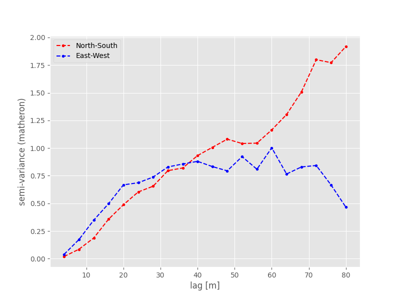
The shape of both experimental variograms is very similar on the first 40 meters of distance. Within this range, the apparent anisotropy is not pronounced. The East-West oriented variograms also have an effective range of only about 40 meters, which means that in this direction the observations become statistically independent at larger distances. For the North-South variogram the effective range is way bigger and the variogram plot reveals much larger correlation lengths in that direction. The spatial dependency is thus directed in North-South direction.
To perform Kriging, you would now transform the data, especially in North-West direction, until both variograms look the same within the effective range. Finally, the Kriging result is back-transformed into the original coordinate system.